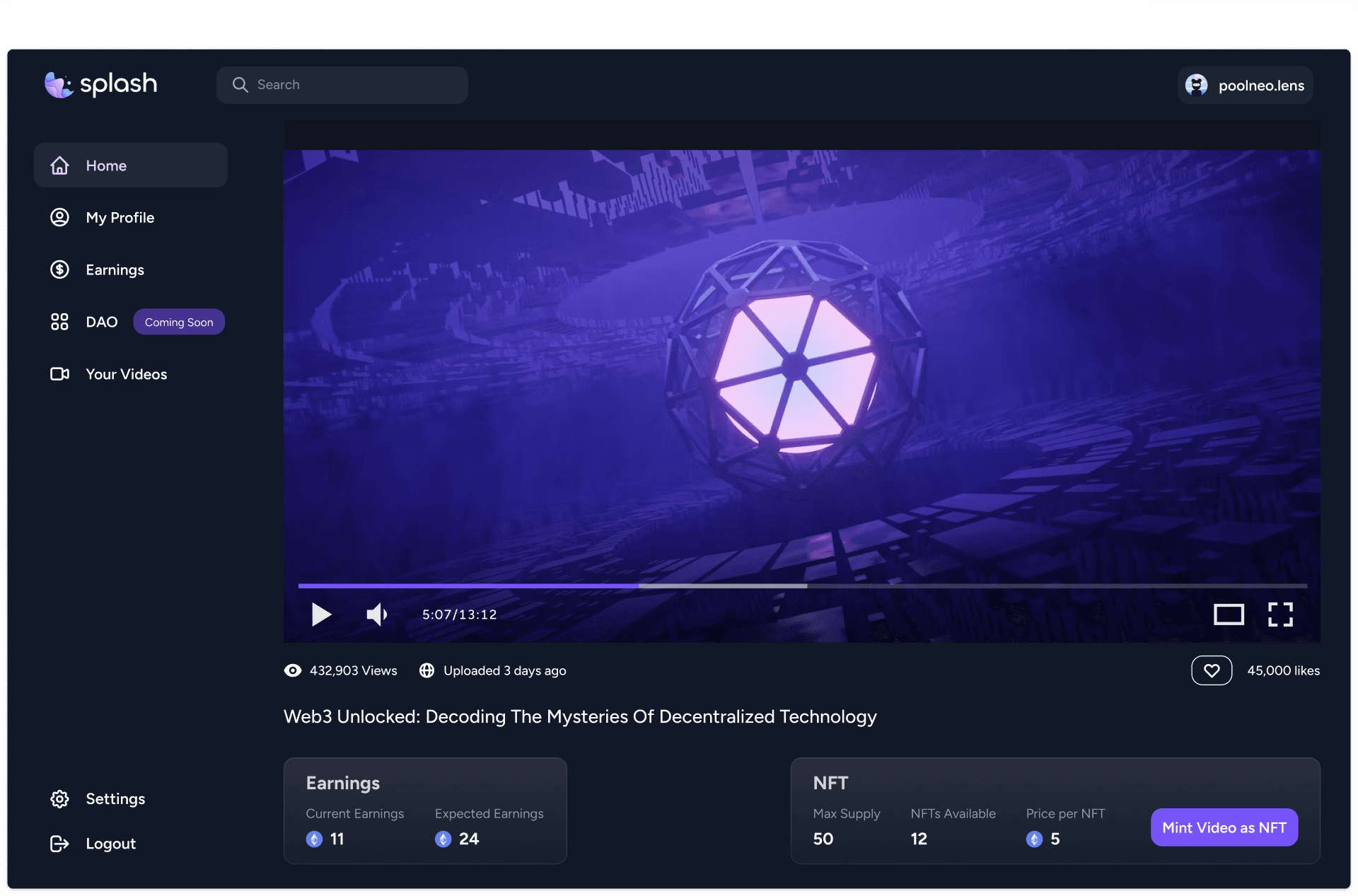
Description
Splash is a Web3 watch-to-earn video streaming platform.
For creators, Splash provides a platform to monetize their videos and reward their loyal fans. Meanwhile, viewers not only have access to quality content but also receive tangible benefits. They earn interest-bearing tokens, with interest computed in real-time, available for withdrawal whenever they wish.
My Role in the Project
I was fortunate to be invited by Joy and Swapneel to take charge of the project's design. When I came on board, they already had an MVP in place but were seeking my help to elevate the app's design and make it more attractive to potential investors.
Being the only designer on the team, my responsibilities encompassed everything visual to create a cohesive product experience: from the product interface and flow, branding nuances to designing NFTs and merchandise.
Being the only designer on the team, my responsibilities encompassed everything visual to create a cohesive product experience: from the product interface and flow, branding nuances to designing NFTs and merchandise.
Visual IdentityBuilding the visual identity from the ground up, I crafted the logo, chose the typography, and decided on the color palette.
UI & UXAlongside the development team, I honed the app's user flow, to ensure a seamless user experience. Then, I designed and prototyped the whole visual interface of the app.
Promotional GraphicsI designed other design materials, such as NFTs, merchandise, and other promotional materials.
App Design Sample Components.
 Realtime earning calculation.
 Earnings Dashboard.
 Leaderboard.
Our goal was to design an app that is intuitive and appeals to users familiar with both traditional content platforms and newer, web3-centric interfaces. It should be usable by anyone without requiring prior training.
Dark Mode
Given our tight development timeline, we had to choose between implementing a dark mode or a light mode. We opted for dark mode because the app focused on video content, and users would likely spend extended periods watching videos, which can strain the eyes. Dark mode helps reduce eye strain during prolonged video viewing.
Futuristic UI Style
Employing dark mode makes it easier to incorporate flashy gradients, glassmorphic, and glowy effects into the components of the app, which were part of the design moodboard the team had prepared. It gives the app a modern feel and differentiate itself from other video platforms in the market. As a bonus, it aligned with the current design trends of web3 dApps.

Transparent Monetization Mechanisms
Since Splash is a watch-to-earn video platform, we want to make sure that monetization mechanisms are transparent and easily understood, without overwhelming users with the complexities of decentralized finance. To do this, we Integrated real-time interest calculation for tokens, allowing users to visualize their earnings immediately while watching the videos. This also instills a sense of reward and engagement.
Since Splash is a watch-to-earn video platform, we want to make sure that monetization mechanisms are transparent and easily understood, without overwhelming users with the complexities of decentralized finance. To do this, we Integrated real-time interest calculation for tokens, allowing users to visualize their earnings immediately while watching the videos. This also instills a sense of reward and engagement.

Our platform also features an earnings dashboard that display users interactions with individual videos and their watch history. Each entry provides details on the video's title, the duration watched, the earnings from that particular video, and the resulting balance after watching. It’s a transparent look at users viewing habits and the rewards they’ve earned.

Community-Centric Features
We Retained familiar features such as the comment section, similar to popular platforms like YouTube, to foster community interactions. We also installed a leaderboard in the home page that showcases users who have accumulated the highest total earnings, watched the most videos, and devoted significant time engrossed in content. The goal of this feature is to not only recognizes and rewards top users for their dedication and involvement but also adds a competitive edge. We hope a friendly competition can drive user activity, creators getting more visibility, and the platform's overall vitality getting a boost.
We Retained familiar features such as the comment section, similar to popular platforms like YouTube, to foster community interactions. We also installed a leaderboard in the home page that showcases users who have accumulated the highest total earnings, watched the most videos, and devoted significant time engrossed in content. The goal of this feature is to not only recognizes and rewards top users for their dedication and involvement but also adds a competitive edge. We hope a friendly competition can drive user activity, creators getting more visibility, and the platform's overall vitality getting a boost.

Final Designs Splash Logo. It meant to capture the essence of water in motion, a water splash.
 Landing Page.
 Earnings Page. Users can track individual video earnings and their resulting balance.
 Splash Merchandise. These t-shirts were made to promote the app at Web3 and Crypto conferences.


Home Page.
Video Watch Page.
Profile Page.

Creator Profile Manager.

